公共服务清晰系统 (Civic Service Clarity)
更像 GOV.UK 这类公共服务入口的高可读网页语言,重点是任务路径、文案清晰和可信,而不是品牌表达。
公共服务站流程办理页服务设计文档
真实网站参考 / Real References
先看这些真实网站 / Open these real sites first
长这样 / Looks Like
- plain language
- 任务入口强
- 层级稳定
- 高可读
适合做 / Good For
- 公共服务站
- 流程办理页
- 服务设计文档
不适合做 / Not For
- 奢华品牌首页
- 实验海报页
- 纯情绪发布页
Skill 包含什么 / What The Skill Controls
截图、排版和规则来自同一套风格包 / The screenshots, layout, and rules come from the same skill packet
配色系统 / Color System
- 颜色服务任务和状态
- 高对比文本优先
- 不要用品牌表达压过清晰度
排版系统 / Typography
- plain language 比个性更重要
- 步骤、按钮、说明和错误提示都要很好读
- 标题像任务入口而不是广告语
版式规则 / Layout Rules
- 先任务,再解释,再扩展
- 服务入口必须明显
- 页面要能支持压力下的快速完成
图片处理 / Image Treatment
- 几乎不依赖氛围图
- 示意图、流程图和图标都应辅助完成任务
- 截图应服务说明而非定调
交互节奏 / Motion
- 动效极少
- 反馈必须清楚
- 稳定性和可访问性优先
AI Prompt / AI Prompt
复制后直接粘贴给 Cursor / Claude / Paste directly into Cursor / Claude
请参考公共服务清晰系统(Civic Service Clarity)风格建站:
视觉特征:plain language / 任务入口强 / 层级稳定 / 高可读
适合场景:公共服务站 / 流程办理页 / 服务设计文档
不适合:奢华品牌首页 / 实验海报页 / 纯情绪发布页
推荐页面组织:工作台型 / Workbench / Tool Shell / 档案堆栈型 / Archive Stack
历史来源:新字体排印 / New Typography / 瑞士风格 / Swiss Style / 包豪斯 / Bauhaus
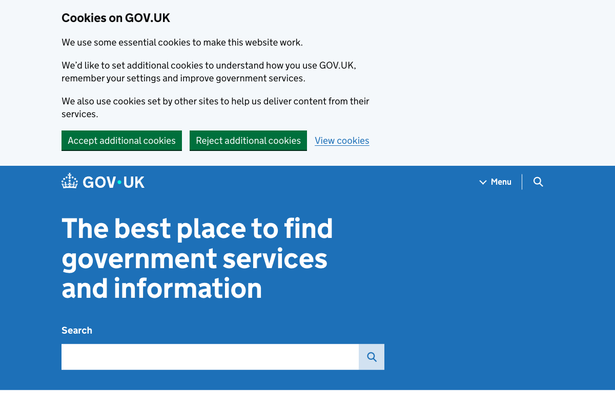
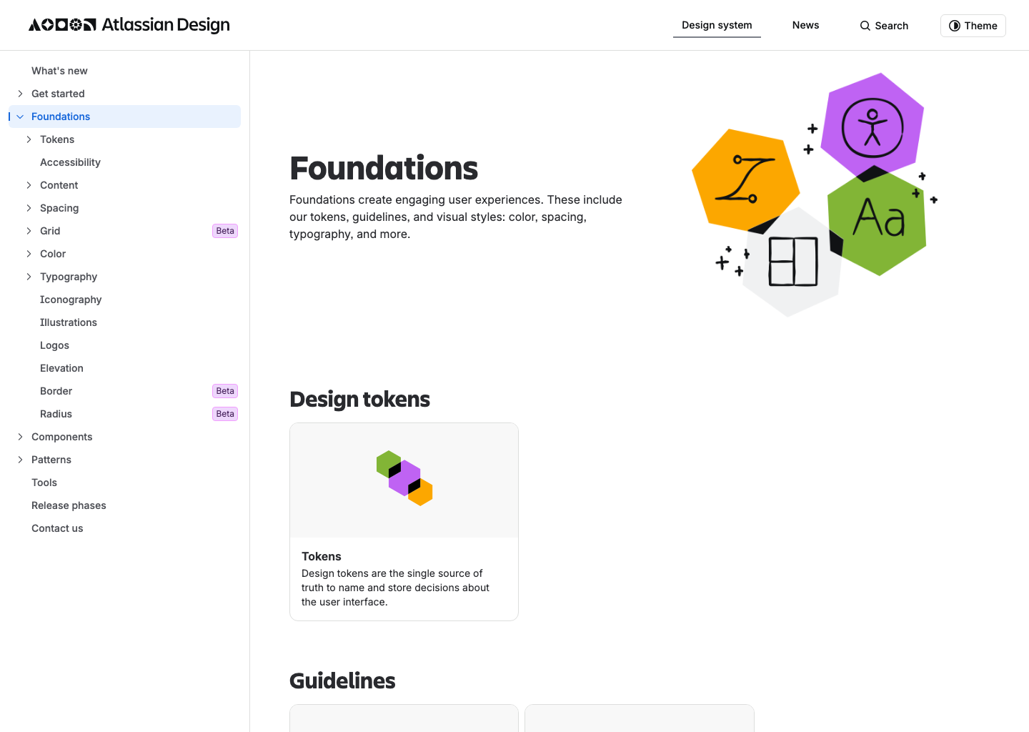
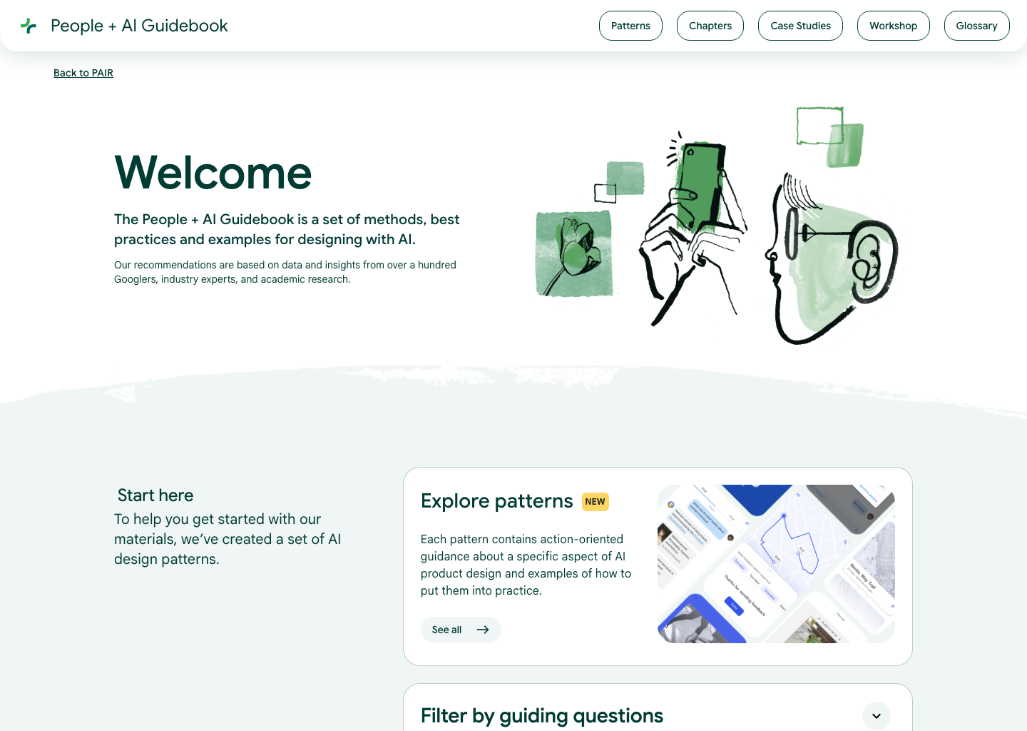
参考网站:GOV.UK: https://www.gov.uk/ / Atlassian Foundations: https://atlassian.design/foundations/ / People + AI Guidebook: https://pair.withgoogle.com/guidebook-v2/
配色系统:颜色服务任务和状态 / 高对比文本优先 / 不要用品牌表达压过清晰度
排版系统:plain language 比个性更重要 / 步骤、按钮、说明和错误提示都要很好读 / 标题像任务入口而不是广告语
版式规则:先任务,再解释,再扩展 / 服务入口必须明显 / 页面要能支持压力下的快速完成
图片处理:几乎不依赖氛围图 / 示意图、流程图和图标都应辅助完成任务 / 截图应服务说明而非定调
风格要求:Use a civic service clarity family: plain-language hierarchy, strong task-entry paths, explicit sectioning, calm trust-first color use, and layouts optimized for completion and comprehension rather than expressive branding.
历史来源 / Historical Roots
这部分放在最后看,用来补背景,而不是先决定风格。 / Use this section to add background after the direction is already clear.
1920s-1930s
新字体排印 (New Typography)
以非对称排版、空白场和摄影/版面组织信息清晰度。
1950s-1970s
瑞士风格 (Swiss Style)
网格、对齐、无衬线、秩序感。它是今天大量知识型、设计型、档案型网页的基础语法之一。
1919-1933
包豪斯 (Bauhaus)
功能、工业和几何秩序优先。它把形式服从用途这件事系统化。