时尚奢刊 (Luxury Fashion Editorial)
更偏时尚与奢刊的编辑型页面,靠图像裁切、节奏和气质建立高级感,而不是靠复杂组件堆叠。
时尚品牌奢刊专题文化品牌
真实网站参考 / Real References
先看这些真实网站 / Open these real sites first
长这样 / Looks Like
- 大片裁切
- 奢华留白
- 时尚感 serif
- 封面节奏
适合做 / Good For
- 时尚品牌
- 奢刊专题
- 文化品牌
不适合做 / Not For
- 工具产品
- 重筛选目录
- 高频任务流
Skill 包含什么 / What The Skill Controls
截图、排版和规则来自同一套风格包 / The screenshots, layout, and rules come from the same skill packet
配色系统 / Color System
- 高对比黑白或低饱和奢华色
- 背景更干净
- 图片质感优先于功能色
排版系统 / Typography
- serif 与 sans 组合更明显
- 标题允许更大片感
- 正文要克制
版式规则 / Layout Rules
- 首屏像大片封面
- 分区像 editorial spread
- 内容密度低于普通内容站
图片处理 / Image Treatment
- 大裁切、大留白、大片感照片
- 不要用产品 UI 截图
- 一页内图片风格保持一致
交互节奏 / Motion
- 更偏优雅 reveal
- 少而慢
- 不要科技感 hover
AI Prompt / AI Prompt
复制后直接粘贴给 Cursor / Claude / Paste directly into Cursor / Claude
请参考时尚奢刊(Luxury Fashion Editorial)风格建站:
视觉特征:大片裁切 / 奢华留白 / 时尚感 serif / 封面节奏
适合场景:时尚品牌 / 奢刊专题 / 文化品牌
不适合:工具产品 / 重筛选目录 / 高频任务流
推荐页面组织:专题长文型 / Dossier / Feature / 沉浸舞台型 / Immersive Stage
历史来源:装饰艺术 / Art Deco / 新艺术运动 / Art Nouveau
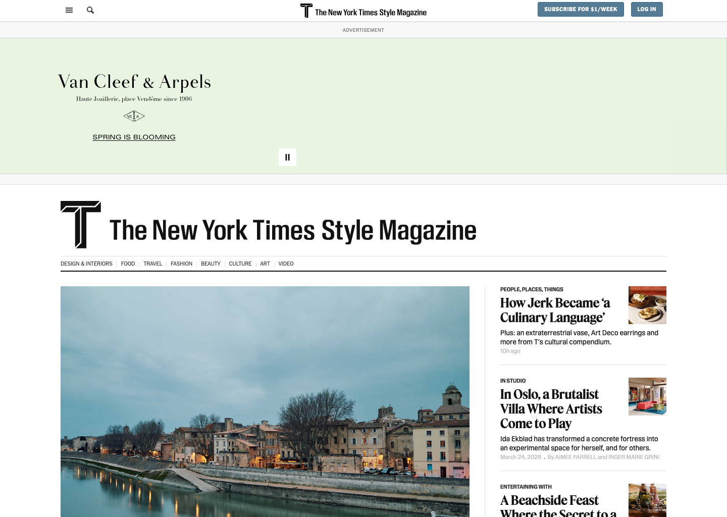
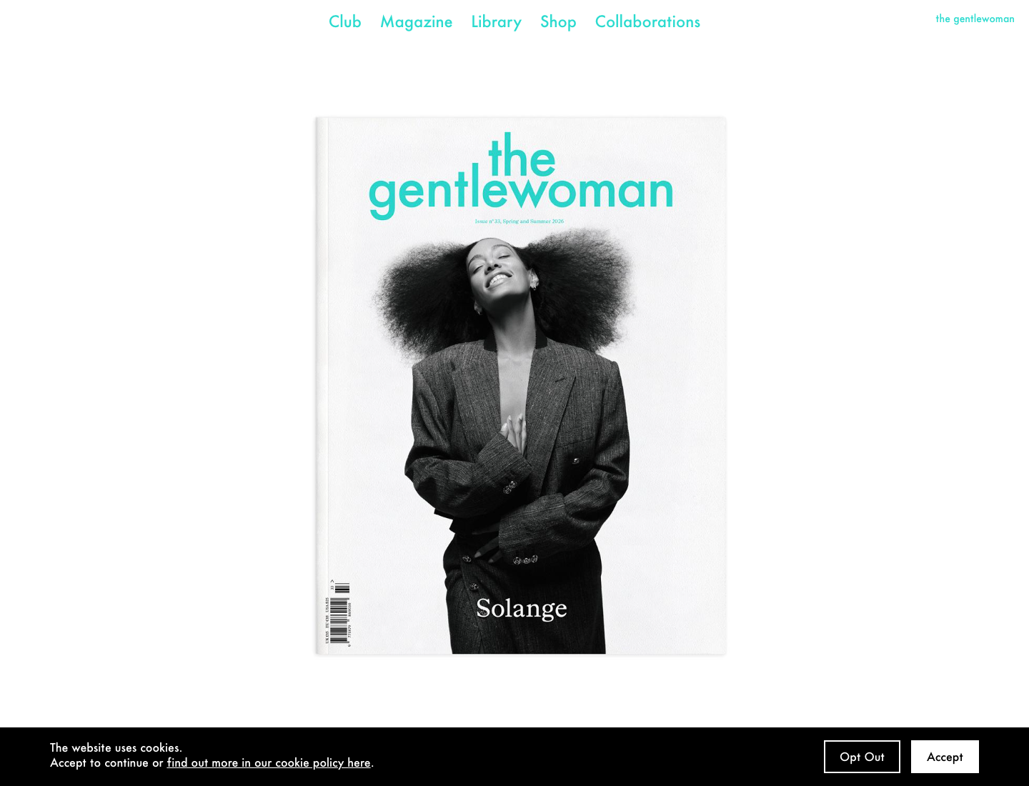
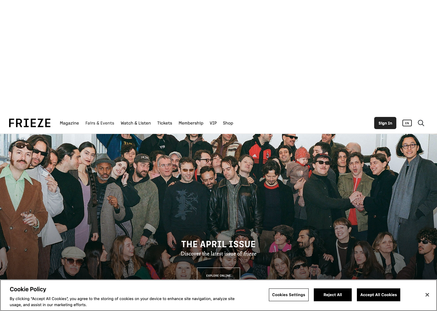
参考网站:T Magazine: https://www.nytimes.com/section/t-magazine / The Gentlewoman: https://thegentlewoman.co.uk/ / Frieze: https://www.frieze.com/
配色系统:高对比黑白或低饱和奢华色 / 背景更干净 / 图片质感优先于功能色
排版系统:serif 与 sans 组合更明显 / 标题允许更大片感 / 正文要克制
版式规则:首屏像大片封面 / 分区像 editorial spread / 内容密度低于普通内容站
图片处理:大裁切、大留白、大片感照片 / 不要用产品 UI 截图 / 一页内图片风格保持一致
风格要求:Use a luxury fashion editorial family: strong crop-led imagery, quiet prestige, serif-led hierarchy, sparse navigation chrome, and section pacing that feels like an issue rather than a feed.
历史来源 / Historical Roots
这部分放在最后看,用来补背景,而不是先决定风格。 / Use this section to add background after the direction is already clear.
1920s-1930s
装饰艺术 (Art Deco)
几何装饰、流线感和高级感并存。今天它更多以精致和舞台感回到网页中。
1890-1910
新艺术运动 (Art Nouveau)
用植物般曲线、装饰性线条和整体设计把视觉做成一体化生命形态。